Understand a facility's status
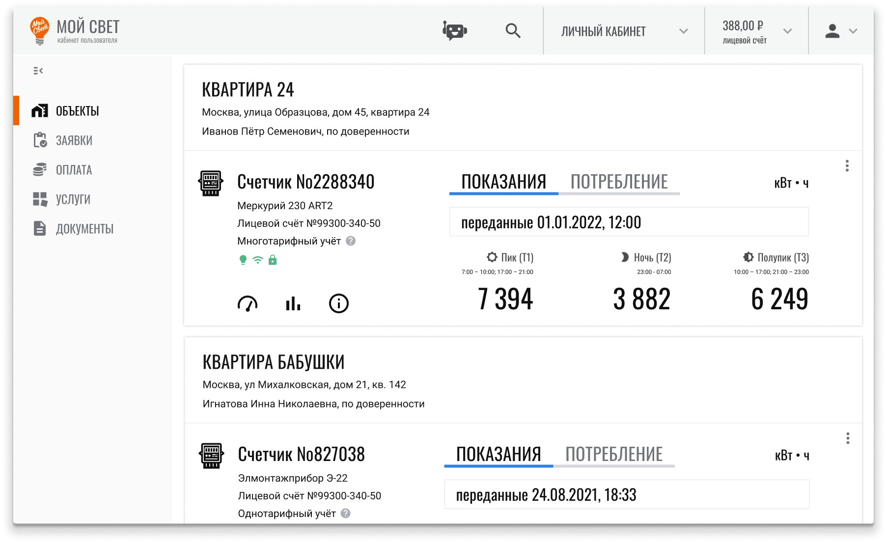
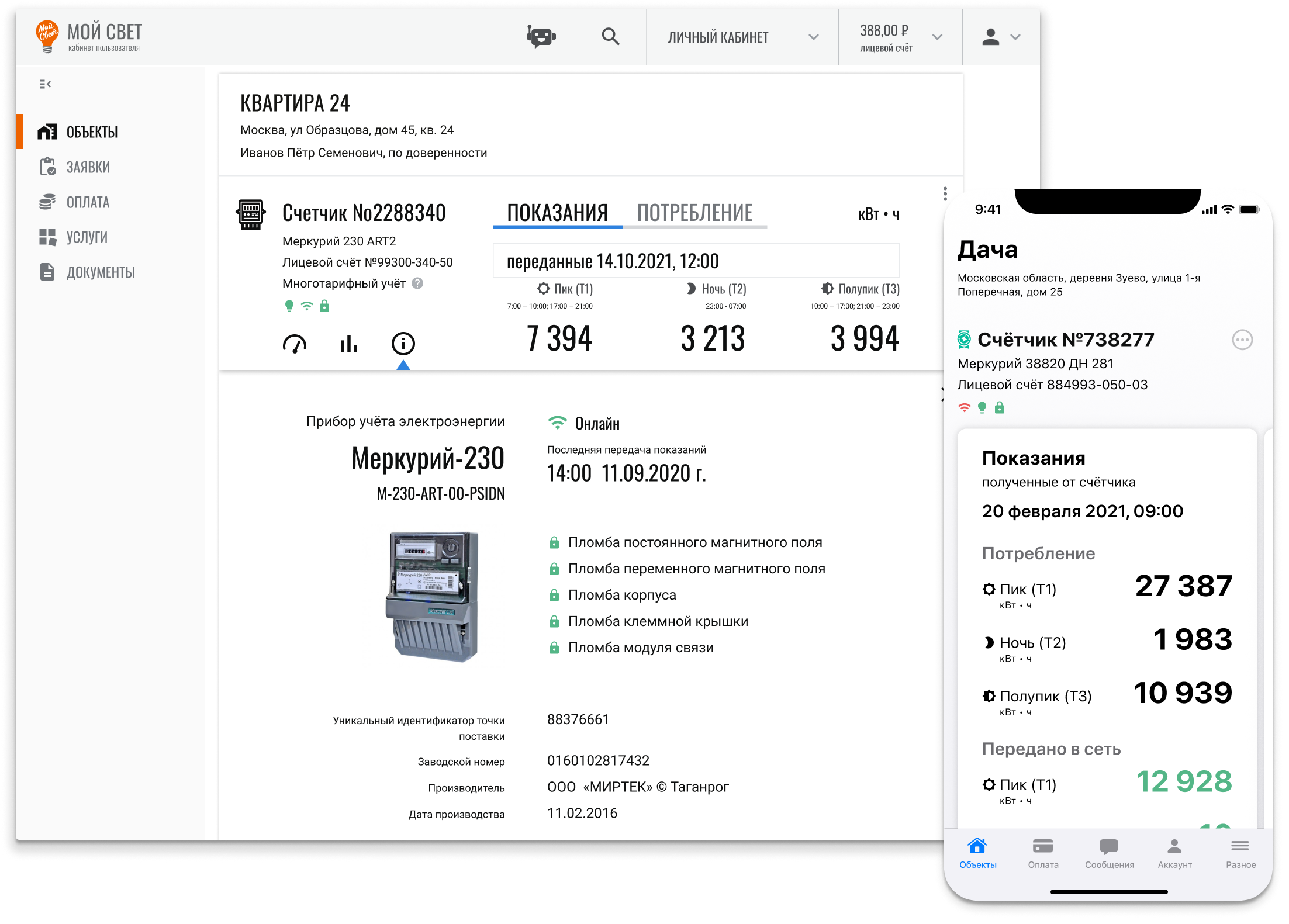
Customers can see current readings and device status. The flow provided for manual submission and the option to receive readings automatically from a meter.
Web: facility details; iOS: essentials on the first screen

Case study · 2021–2022
A customer portal for monitoring electricity use
I adapted work from an enterprise energy platform for customers: I designed connected web and iOS flows, refined the interface through early checks and created the product's visual identity.
Context
From a B2B platform to a customer portal
The team had already developed work for an enterprise energy platform. As the product expanded into a customer portal, the audience changed: the interface would serve the company's customers rather than industry professionals.
Users needed to see readings quickly, understand consumption trends and find documents or payment options. I helped prepare user stories with the Product Manager, created prototypes and designed interfaces for both platforms. He defined the product concept and approved the UX; I designed the visual identity and some interface solutions independently.
Checking the solutions
Hypothesis → prototypes → changes
We started with the assumption that users needed clear readings and device states. Following a preliminary survey, I prepared prototypes and checked whether people could complete the flow and find the information they needed without unnecessary questions.
Company employees who were not involved in the product worked through scenarios as stand-ins for end users. These hallway checks typically involved 2–3 people.
Based on the feedback, the team made the layout more familiar and revised the palette, font sizes in data-dense areas, icons and labels.
In iOS, we refined the priority of readings, charts and device states, making them more prominent than secondary information.
The checks helped refine layout, labels and visual emphasis, but do not validate the needs of all customers. Full testing was planned for after release.
Solution
One system · two contexts
The web portal brought together full information on facilities, readings, statistics, finances and documents. In iOS, the first screen focused on key data and notifications.
Customers can see current readings and device status. The flow provided for manual submission and the option to receive readings automatically from a meter.
Web: facility details; iOS: essentials on the first screen

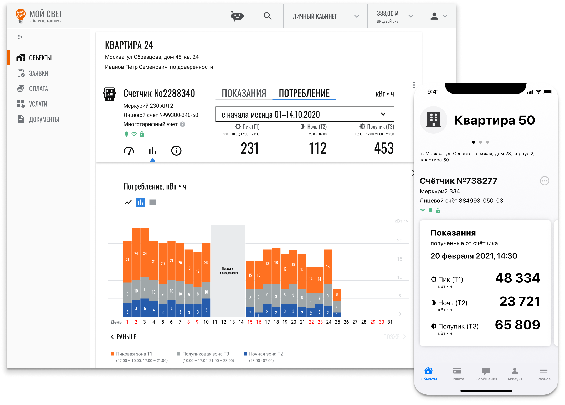
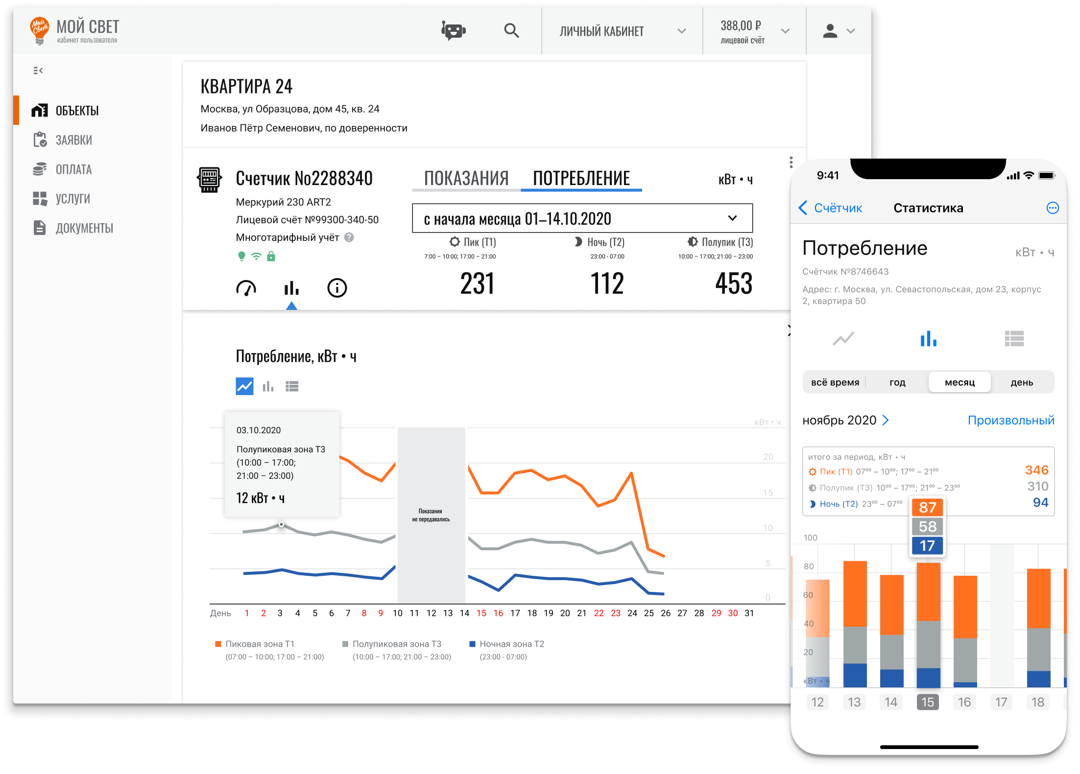
History and charts help users assess consumption over time. The web interface provides more detail; the mobile screen keeps the key chart within easy reach.
Web: tables and statistics; iOS: a concise trend view

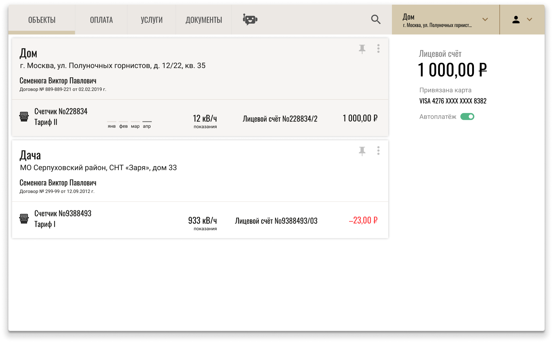
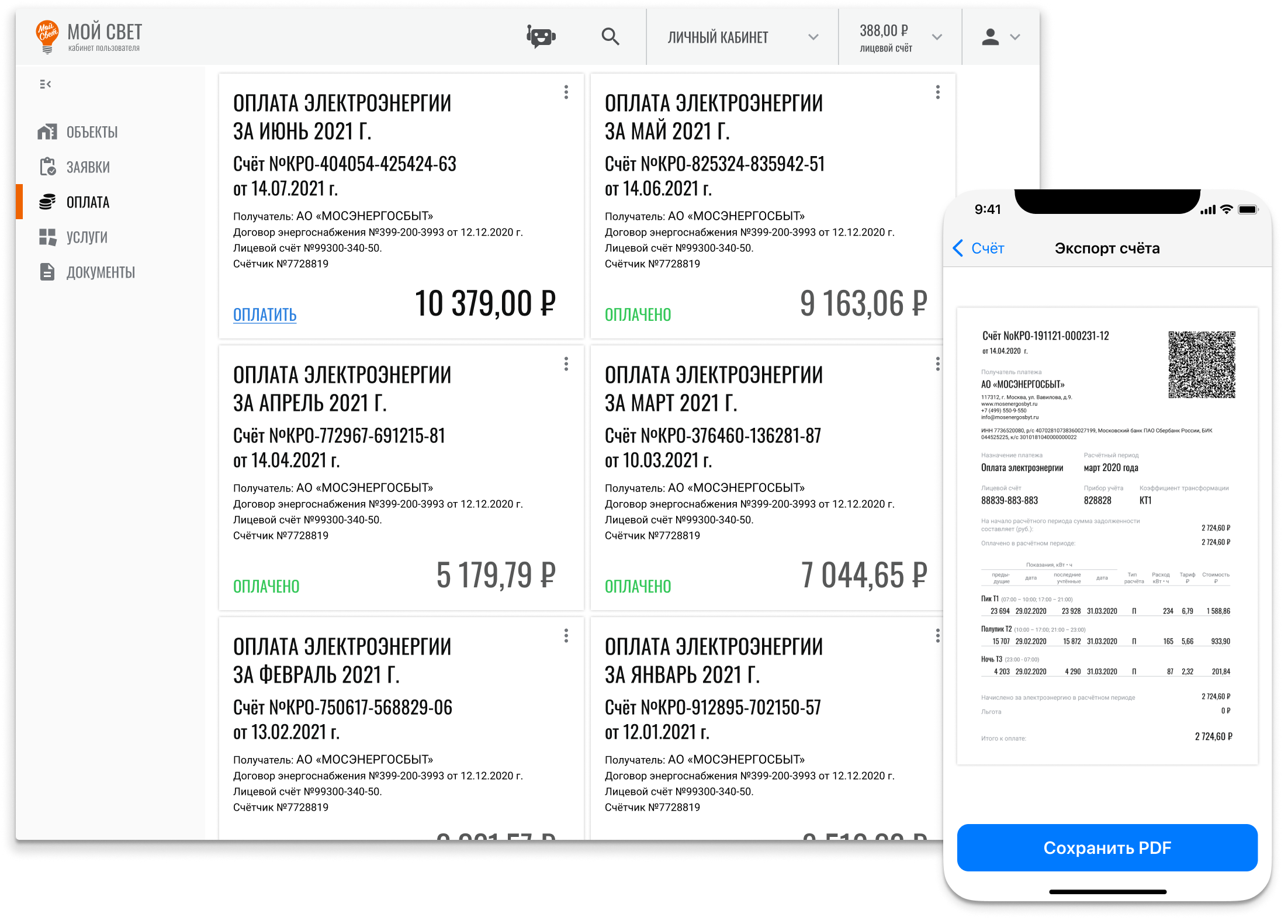
Documents and payment flows are linked to the user's facility. The web interface presents the full information, while iOS provides access to key documents on the go.
Web: finances and documents; iOS: bills at hand

Outcome
Results and reflection
I designed the UI, visual identity, logo and mascot for the customer portal. I added custom icons to the system icon set and used stock illustrations.
No structured testing of the finished app took place during my involvement; only the build was checked. There is no data on its impact on product metrics.
What I would change todayI would revisit the visual style, break long forms into steps and give readings and device states greater prominence.